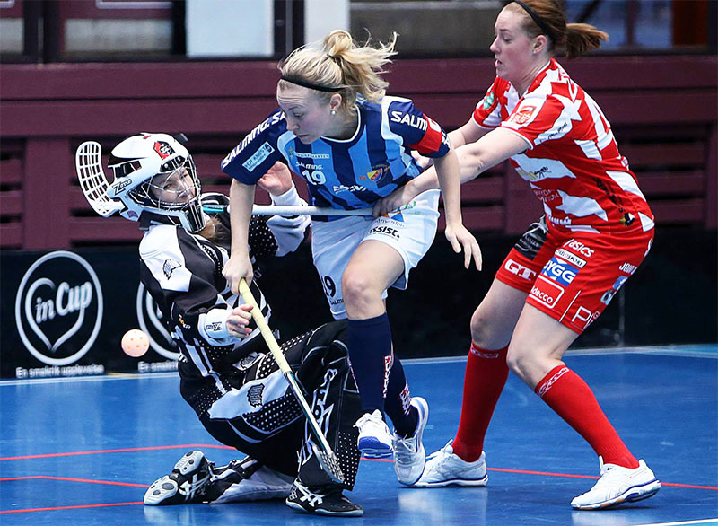
Red, blue, green or maybe pink? If you’re choosing a new color design for your club, you should definitely read this article. 10 golden rules to become not only a beautiful team, but a successful one, too.
___STEADY_PAYWALL___
1. Let colors speak.
Blue is trustful but naive, green generous but indifferent. Colors transport emotions and messages. Before you pick your club’s new shades, you should read our article „What Colors Say About Your Floorball Club„.
2. Think of combinations.
At the beginning one color might be enough. But in the process of designing high class marketing stuff you’ll need a secondary color, if not even a third one. There are strict rules how to match colors. The Paletton website might come in handy.
3. Be flexible.
Your color will be applied to different materials on different platforms. Jerseys out of textiles, magnets out of metal, flyers out of paper… and than all these digital channels. Your colors should stay the same no matter what you do to them. As a start, open Photoshop and try to find a shade, that is almost identical defined by the RGB as well as by the CMYK code.
4. Match with equipment.
Although most brands consider plenty of colors in their collections, new series or products with lower sales expectations are being rather produced in neutral (black and white) or in the most popular team colors. If you want to have a wide range to choose from, go for red or blue. Avoid neon and aquarelle colors.
5. Plan your sales.
Choosing club colors also means developing your merchandising products. Cups and flags are no problem and if your fans love you, they’ll wear anything. However, think fashion, too.
6. Attract sponsors.
When sponsors consider a cooperation with you, they imagine how their brand would fit into your communication tools and vice versa. Your colors will not match to every interesting sponsor, to the black and blue car manufacturer or to the yellow and green brewery. But at least consider a bold and (!) flexible design.
7. Make a difference.
If each and every main color is already taken in your competition, it will be difficult to be unique. An attractive combination might make a difference (see rule number 2). Positive examples are clubs such as Mullsjö AIS (blue and orange), Eiche Horn Bremen (yellow and green) or UHC Dietlikon (blue and yellow).
8. Define your colors
Define your colors with all relevant codes. RGB, CMYK, Pantone & Co. If you neglect this task you’ll wonder why your jersey’s green is different from your logo’s green, from your fan scarf green, from your website green.
9. Identify.
„Los Blancos“ (Real Madrid), the „Blueshirts“ (New York Rangers) or the „Rossonieri“ (AC Milan). Create a nickname, build witty slogans or put it even in your club name. It will help to install your color in the narrative of your club’s history. Helful if story…
10. Keep it real.
If you redesign your clubs visual identity, change everything and then stick to it. You might need to work with different shades to create professional designs, but your central elements should follow your essential color.

